Creating clear screens helps players act fast. Modern interfaces use visual cues to guide a player toward the intended action. This reduces friction and saves time when navigating menus and options.
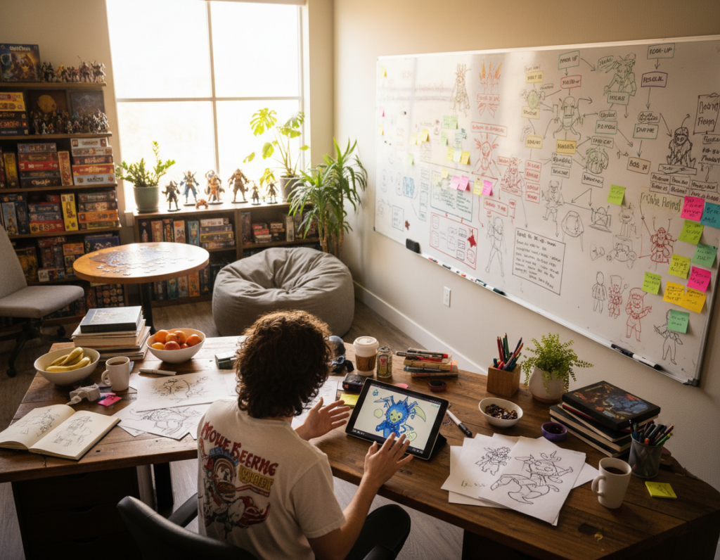
Every designer on the team must study how a user reads the screen. They ask specific questions about button placement and flow during the early process. Small changes in layout can change the whole player experience.
Consistency gives a strong sense of immersion and can improve the match between art and the game world. Developers often spend seconds refining menus so players feel confident from the first moment.
Reference resources like Alike Studio’s All of You and the Game UI Database offer many screenshots designers use for inspiration. With nearly 1,000 games and over 41,000 images, teams can iterate faster and get better results.
Defining the Role of Game UI Design
Interfaces act as a translator between mechanics and the player. A clear bridge keeps the core systems visible and reduces friction during play.
Designers must keep their focus on how the user scans the screen. Small visual cues steer attention and make options easy to find.
Applying design theory helps teams craft uis that offer meaningful options. Thoughtful layouts let players customize controls, accessibility, and feedback without confusion.
- Core clarity: Show mechanics so decisions are obvious.
- User agency: Provide options that match playing styles.
- Scalable theory: Use proven patterns so new players learn fast.
Well-made interfaces connect players and games. When the interface is predictable, the overall experience becomes more immersive and inclusive.
Essential Game UI Design Tips for Modern Developers
Clear, purposeful layouts let players find what they need in seconds. Teams should craft a screen that communicates status, goals, and controls without extra clutter.
When planning menus, developers must map common flows so each button sits where the player expects it. That reduces hesitation and speeds up navigation during play.
Players often have questions about mechanics. Presenting concise options and contextual help cuts confusion and lowers support requests.
Prioritize the player by hiding rarely used elements and highlighting critical actions. A modern approach keeps the screen readable, even in tense moments.
- Make buttons obvious: label actions with clear verbs and group related options.
- Test paths: validate that users reach key menus in two or three steps.
- Iterate quickly: refine visuals so interfaces stay competitive and friendly for all players.
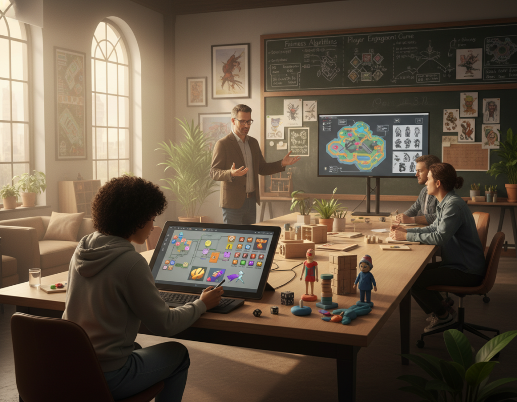
Understanding the Collaborative Design Process
A cohesive character screen emerges when art, motion, and flow are planned together. This collaboration ensures the display feels unified and purposeful for players. Teams that share early sketches avoid rework and save time later.
UX and UI Synergy
UX specialists map the player journey and set priorities for clarity. Visual designers then match art and colors to the world so the character panel reads instantly.
When the team aligns on hierarchy, each action is obvious and the player spends less time guessing.
Motion Graphics Integration
Motion adds a subtle layer that makes choices feel responsive. Atlus’ 13 Sentinels: Aegis Rim shows how motion and visuals can lift a character screen into a memorable moment.
“Motion can turn a static list into an expressive, living interface.”
- Close collaboration reduces revisions and keeps the work cohesive.
- Motion artists add polish so every action feels satisfying to the player.
- A skilled designer balances art, color, and movement to enhance the character experience.
Categorizing Interface Components
A clear taxonomy for screen elements makes every control easier to learn and use. Teams that sort assets by purpose ensure each icon and button serves a single, visible role. This step is a core part of the development process.
On a clean screen, the player finds options fast. Clear grouping gives strong visual cues and defines the core gameplay flow. It also reduces accidental taps and lowers support requests.
Developers should make each icon distinct. Consistent shapes, color rules, and spacing help the user identify function quickly. Standardizing components across levels makes games easier to learn.
When components follow a shared system, iteration speeds up. Teams can reuse assets, keep a predictable layout, and focus on polish rather than fixes. The core of a successful interface is how well every icon supports player actions.
- Group by function: separate navigation, feedback, and action controls.
- Standardize visuals: use consistent iconography and button treatments.
- Test clarity: confirm players identify core elements in a single glance.
Mastering Diegetic and Non-Diegetic Elements
Understanding which elements live in the world and which sit outside it changes how players interpret the screen. Diegetic elements occupy the same reality as the character, like a wrist display or a holographic text a character reads.
Non-diegetic elements exist solely for the player. Menus, overlays, and status panels provide context without claiming to be part of the world.
Spatial elements are placed inside the world to guide movement—an arrow pointing the way or an outline around an objective. They keep navigation intuitive and reduce the need for extra menus.
Meta elements use subtle color overlays, bars, or text to show status and maintain immersion. When used well, these ones inform the player without cluttering the view.
“Mastering diegetic, non-diegetic, spatial, and meta elements is a core theory that makes scenes feel cohesive.”
- Diegetic: in-world feedback the character can notice.
- Non-diegetic: player-only context and menus.
- Spatial & meta: guide and inform while preserving immersion.
Implementing Spatial and Meta UI Representations
Placing indicators inside the world helps players orient themselves without breaking focus. Spatial representations insert cues directly into the environment so the player reads the scene, not a separate overlay.
Spatial markers point to objectives, hazards, or paths. They reduce the need for a busy screen and let the player act from context. A well-placed marker explains location and intent at a glance.
Meta elements complement spatial cues. Subtle overlays, soft color shifts, and edge glow deliver status without pulling attention away from the world. These methods preserve immersion while sharing vital info.
Balance is key. Too many in-world icons crowd the scene. Too many overlays break immersion. A thoughtful mix keeps the experience natural and informative for players.
- Use spatial cues for navigation and in-world feedback.
- Apply meta overlays for global status and subtle alerts.
- Test density so the screen stays readable and immersive.
Optimizing the Heads-Up Display for Player Clarity
A heads-up display must present vital stats without pulling attention away from play. HUDs should live at predictable edges of the screen so players check status fast and return focus to the world.
Contextual Information Placement
Place persistent elements like a health bar where eyes naturally rest. Atlus’ Persona 5 keeps health and stamina in the bottom-right corner of the screen to be both visible and unobtrusive.
Prioritize legibility: use high contrast, clear text, and distinct icons so a player reads data at a glance. Limit layers and avoid overlapping critical character visuals.
- Keep core data visible: health, resource bars, and action button in consistent spots.
- Use context: show extra information only when relevant to avoid clutter.
- Match color and iconography: consistent rules improve reaction time and immersion.
A well-optimized HUD blends text and simple icons to deliver clear information. This reduces reaction time and improves the overall experience for players.
Balancing Gauges and Previews in Gameplay
Showing long-term meters and short previews together helps players choose with confidence. Gauges give the big-picture information. Previews provide immediate feedback for the next action.
Developers must tune these layers so a player makes decisions in just a few seconds. A progress bar or a concise text layer reassures the player about outcomes. Keep important info visible but not dominant.
“Gauges reveal trends; previews show the result of the current input.”
Allowing customization is vital. Let players hide or resize meters, change density, or move a small preview near a button. This gives flexible options for different play styles.
- Balance: pair a persistent gauge with a transient preview.
- Clarity: use short text and clear bars for quick reading.
- Control: provide toggle options so players tailor the information layer.
How gauges and previews are presented is a core part of the game experience. Thoughtful placement helps players understand consequences and act with certainty. For practical examples on improving interfaces, see leveling up your interface.
Selecting the Right Software for Interface Creation
A well-chosen system removes friction from the prototyping process and keeps work consistent. The tool a studio picks affects how the team builds screens, tests interactions, and shares assets.
Prototyping Functionality
Prototyping lets designers test layout, button response, and timing before final art arrives. Fast prototypes reveal usability problems early and save time during the build phase.
Real-Time Collaboration
Tools with simultaneous editing reduce questions and speed decisions. When the team edits the same file, feedback loops shrink and coordination costs fall.
Reusable Asset Libraries
Shared libraries keep assets consistent across screens and layers. A robust library helps the designer reuse icons, color rules, and components so work stays uniform as the project grows.
- Pick software that supports prototyping and live collaboration.
- Prioritize systems that host reusable assets and version control.
- Test workflows early so the whole team aligns on process and options.
Streamlining the Design Handoff Workflow
A tight handoff process turns creative mockups into build-ready screens without guesswork. It gives the team a clear path from prototype to final code.
Provide concise, itemized information for every button, state, and animation. Clear notes prevent assumptions and cut the time spent on back-and-forth questions.
The designer should work with engineers and QA to make a simple, repeatable process. Shared libraries, annotated assets, and a verified checklist keep intent intact during the handoff.
- Document every element: names, sizes, colors, and behaviors.
- Use tools that export specs: so the team moves from mockups to build with fewer errors.
- Hold brief reviews: confirm the screen logic and catch issues early.
Refining this workflow ensures the final product reflects the original vision. For a practical planning aid, teams can follow a handoff checklist to standardize the process and protect quality.
Managing Information Density in Strategy Games
Keeping the right information visible lets commanders act without losing the bigger picture. Strategy titles must balance micro tasks and a broad game world so players move fast and stay aware.
Managing information density is a core challenge. Rise of Nations shows how clear layering helps a player track economy and combat at once.
By contrast, Planetary Annihilation split vital data across three zones and forced players to divide attention. That broke immersion and slowed decision time.
Age of Empires 3 offered adjustable transparency so the screen never felt crowded. Small controls that hide or fade let players tune how much they see.
Good uis let players monitor the world without constant panel switching. Designers should place persistent elements where eyes naturally rest and surface extra data on demand.
- Prioritize: show vital stats, hide secondary data until needed.
- Layer: use transparency and context to reduce clutter.
- Test: validate that a player can act quickly during intense moments.
“A great interface allows the player to monitor the world without constantly flipping between screens.”
Leveraging Hotkeys for Competitive Play
Hotkeys let competitive players move through menus and act with near-instant precision. They reduce the need to hunt for a button and save valuable seconds during critical moments.
Standardizing Command Conventions
Standard conventions help players learn the system faster and stay consistent across matches. When the team agrees on common bindings, muscle memory forms quickly.
Visual icons tied to each hotkey make information visible on the screen so the player always knows which option maps where. Icons paired with short labels speed recognition and reduce errors.
- Speed: hotkeys enable an action in seconds rather than multiple clicks.
- Consistency: standardized commands improve performance across times and modes.
- Accessibility: rebindable keys let all players choose a layout that suits their way of working.
Competitive players rely on shortcuts to manage complex menus and keep focus on play. A clear, documented system cuts confusion and helps teams iterate without breaking consistency.
Creating Educational Interfaces for New Players
Tooltips and progressive hints frame information so the player learns by doing. These on-screen helpers introduce mechanics and explain controls as the user explores the world.
Icons and concise popups answer common questions in the first few hours. A clear icon near a button or control reduces confusion and saves time. Small, contextual help makes each step feel natural.
A sense of progression matters. Start with basic options, then reveal advanced information as the player gains experience. Let players opt into extra details so the interface never feels overwhelming.
- Layered help: visible hints first, in-depth tooltips on demand.
- Answer questions: use icons and short text to explain actions.
- Scalable info: offer advanced views for experienced players.
Theory behind educational interfaces links the world to the player. When helpers respect context and pacing, immersion improves and new players learn faster. For a deeper guide on creating inclusive resources, see mastering engaging player resources.
Maintaining Visual Consistency Across Assets
Consistent visual rules make every screen read as part of the same world. This core approach keeps the player focused and reduces the time spent hunting for options.
The team should set clear color palettes, animation standards, and art treatments so every element will match. A shared library of assets enforces those rules and speeds the process.
Legibility matters. Consistent colors, spacing, and font weights help a player identify important information fast. When elements match, the interface reads faster and feels more polished.
- Standardize assets: use a single source for icons, buttons, and panels.
- Align motion: keep animations consistent in speed and easing.
- Audit colors: confirm palettes work across screens and lighting.
- Review for legibility: test how players read text and symbols at a glance.
Maintaining visual consistency improves immersion in modern games and keeps the player confident when choosing options. Small investments in standards save time and deliver a professional result.
Conclusion
A strong finale ties practical methods to clear outcomes for the player.
Mastering interface work is an ongoing process that requires close attention to how the player reads and acts. Clarity and consistency speed learning and reduce friction.
The art of craft lies in balancing form and function so every element earns its place. That balance yields a better experience and a predictable result for users.
As technology changes, teams must refine workflows and iterate over time. This guide aims to give the tools needed to start creating intuitive, accessible screens today.